Please consider the following “two” user interface enhancements:
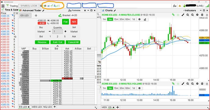
In the image I have circled in red the icons that represent the user established screen widgets that are open. These are great I am hoping that a change can be implemented that when a user clicks on one of those icons the widget becomes the active widget in the forefront of the screen, visible over the other widgets. That way a user could quickly cycle through the open widgets as needed.
Right now users (at least myself) have to layout the interface so that you can see a slim amount of each widget to click on it and bring it to the forefront. (apparent in attached image) This makes it difficult to have any more than a handful of widgets open at a time which dramatically reduces the power of the application.
The second request would be to have the ability to create multiple tabs at the top of the interface each having their own layout and sets of widgets. (see blue squares in image). This one change to the application would greatly enhance the useability of the application.
Thanks for listening. @MikeIronbeam
